


Landing Page Checklist

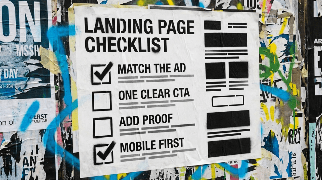
If you are paying for traffic but not getting enquiries, it is rarely “the ads”. It is usually the landing page. Use our checklist to fix the biggest leaks first.
Our landing page checklist is for small businesses running ads, getting traffic, and still hearing… nothing. A landing page has one job: make the next step easy. If it is trying to do ten jobs at once, it usually does none.
You can DIY these fixes quickly. If you want us to build and test the page properly, we can do that.
The quick version
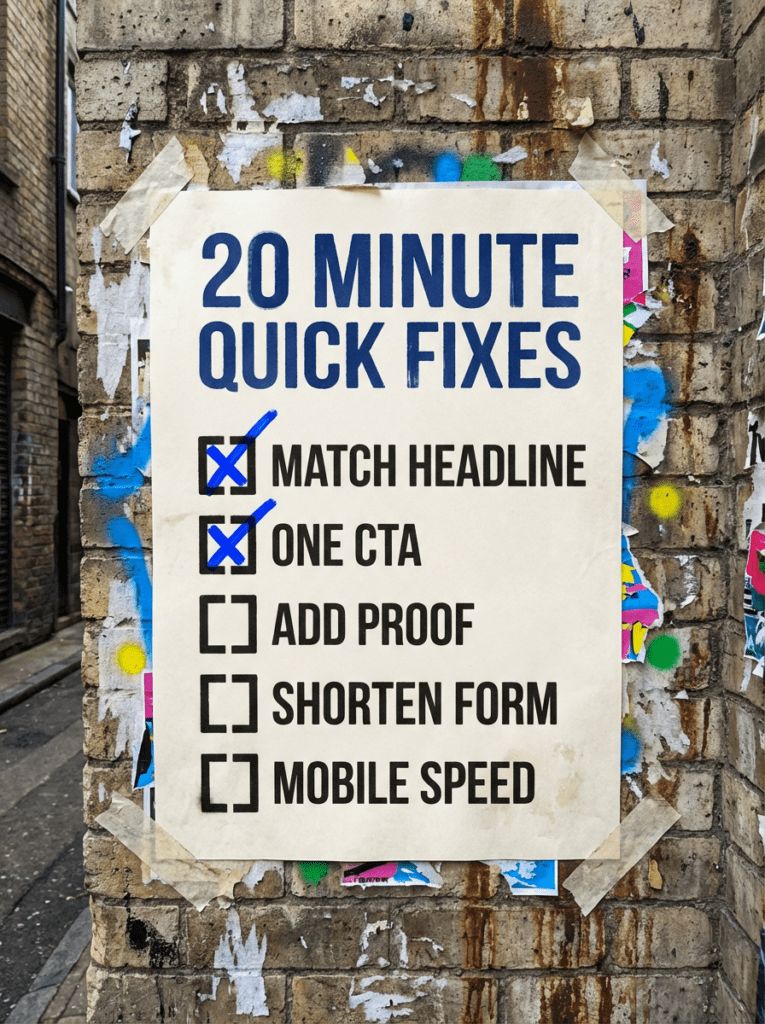
If you only have 20 minutes, do these first. These are the fastest wins in our landing page checklist.
- Make the headline match the ad
- Put one clear next step above the fold
- Add proof near the CTA
- Remove form friction
- Make it fast on mobile
If that already feels like a lot, do not worry. Below is our full checklist in the right order.
Not sure what a landing page should do?
A landing page is not your homepage. It is not a brochure. It is a single focused page that matches what someone just clicked on, answers the obvious questions, and makes it painless to take the next step.
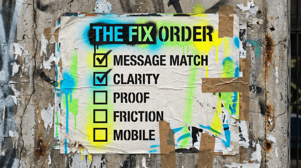
Our full landing page checklist
Work through this in order. It is designed to stop you “tweaking forever” and start improving conversion.
Step 1: Message match
If the ad promises one thing and the page talks about something else, people leave.
The quickest way to catch this: read your ad headline out loud, then read the page headline straight after. If they do not share the same words, you have found your leak. Not similar words, the same ones. Someone who clicked an ad for emergency boiler repair should land on a page that says emergency boiler repair, not one that says heating solutions for the modern home.
This is also where dynamic keyword insertion catches people out. It makes the ad match the search, then drops the click on a page that matches neither. If you use it, go and check where those clicks actually land.
Checklist:
- Headline repeats the offer in plain English
- First paragraph confirms who it is for and what happens next
- The page matches the keyword or ad theme
Step 2: One page, one outcome
Decide the single action you want.
Two calls to action is one too many. Every extra option is a decision you are asking someone to make before they have decided to buy anything, and the usual result is that they make none of them.
The navigation bar counts. If your landing page carries your full site menu across the top, you have given every visitor eight ways to leave and one way to convert. Strip it back to a logo and a phone number.
Checklist:
- Call, form, booking, or purchase, pick one primary action
- One main CTA repeated, not five different CTAs
- Remove distractions that pull people away
Step 3: Above the fold clarity
People decide fast.
Try this. Show the top of the page to someone who does not know your business, give them five seconds, then take it away and ask what you sell and who for. If they cannot tell you, neither can a stranger who has just arrived from an ad.
Above the fold on mobile is a lot smaller than you think it is. Check it on a phone before you decide it is fine.
Checklist:
- What you do, who it’s for, and the benefit is obvious
- One clear CTA visible without scrolling
- Key trust signal visible early
Step 4: Proof, not promises
Most landing pages fail because they ask for trust they have not earned.
If you do not have a wall of recognisable client logos, do not try to fake the effect with stock photography and vague claims. Specific beats impressive. One review that names the job, the town and the outcome does more work than five generic five star ratings with no detail behind them.
Proof also has to sit next to the thing you are asking for. A testimonials section at the bottom of the page is proof nobody reads. Move one line of it up beside the form.
Checklist:
- Reviews or testimonials near the CTA
- Short proof points: numbers, outcomes, timeframes where relevant
- Photos or examples that feel real
- Guarantees only if you actually mean them
Step 5: Remove friction
Friction is anything that makes it harder to convert.
Every field you add is another reason to give up. Ask for what you need to have a useful first conversation and nothing else. You do not need their company size or their budget range before you have spoken to them once.
Tell people what happens next, in plain terms. “We will call you back within one working day” removes more hesitation than another paragraph about your values.
Checklist:
- Keep forms short
- Explain what happens after they submit
- Reduce required fields to the minimum
- Offer an alternative if they’re not ready (call, email, WhatsApp if you use it)
Step 6: Mobile experience
Most small businesses lose conversions on mobile without realising.
Test it on an actual phone, on mobile data, not on your desktop with the browser window shrunk down. Those are two different experiences and only one of them is what your customers get.
Pay particular attention to the form. Forms are where mobile pages break most often, and a broken form looks exactly the same as a page nobody wanted to fill in.
Checklist:
- Text is readable without zooming
- Buttons are easy to tap
- The form works properly
- The page loads quickly over 4G
Step 7: Speed, without overdoing it
You do not need perfection, you need “fast enough”.
One number matters more than the rest: how long it takes for the main content at the top of the page to appear. Chasing a perfect score in a speed testing tool is a good way to spend a week and gain nothing a customer would notice.
The usual culprits are an oversized hero image and a stack of tracking scripts nobody has audited in a year. Start there before you start rebuilding anything.
Checklist:
- Compress images
- Avoid massive videos on the page
- Reduce third-party scripts
- Check the page on your phone, not just desktop
Step 8: Tracking the basics
You cannot improve what you do not measure.
Expect your Google Ads conversion count and your GA4 number to disagree. They measure different things and they attribute them differently, so pick one as the number you make decisions on and stick with it rather than trying to reconcile them every month.
If enquiries come in by phone, track calls properly. Otherwise half your results are invisible and you will eventually switch off the campaign that was actually working.
Checklist:
- Track form submits
- Track calls if calls matter
- Confirm conversions in Google Ads, not just GA4
- One simple dashboard view you actually check
Step 9: Test one thing at a time
Do not change ten things and guess what worked.
Honest caveat for small budgets: proper testing needs more conversions than most small businesses get in a month. If you are getting a handful of enquiries, a test comparing two button colours will never tell you anything you can rely on.
So make big changes rather than small ones. Rewrite the headline, change the offer, cut the form in half. Those are large enough to show up even in small numbers. Save the fine tuning for when you have the volume to measure it.
Checklist:
- Change one section
- Give it time
- Keep the winner, bin the loser
Which step is your problem?
Working through nine steps in order is fine if you have the afternoon. If you do not, this narrows it down.
- People arrive and leave within seconds. Message match and above the fold clarity, steps 1 and 3.
- People read the page but never start the form. Proof, step 4.
- People start the form and abandon it. Friction, step 5.
- It works on desktop and dies on mobile. Steps 6 and 7.
- You cannot tell what is happening at all. Tracking, step 8.
Check your analytics for which of those is actually true before you start changing things. Guessing which step is broken is how pages get tweaked forever without ever improving.
Common mistakes that kill conversions
These are the usual reasons a landing page checklist is needed in the first place.
- Sending paid traffic to the homepage
- Headlines that do not match the ad
- Too many CTAs
- No proof near the CTA
- Forms that ask for everything
- Slow mobile pages
- Walls of text with no structure
- Stocky, vague promises instead of specifics
DIY lane vs done for you lane
DIY lane:
If you want to DIY our landing page checklist, start with message match, one CTA, proof, and friction removal. Those move conversion fastest.
Done for you lane:
If you want the time-saving version, we will rebuild the page around intent, tighten the offer, add proof, and test improvements so clicks turn into enquiries.
Related guides on The Wall
If you’re working through a landing page checklist, these guides will help you bring in better traffic and make the page work better once people land on it.
- Read Google Ads for small business if you want to send more targeted traffic to the page instead of relying on guesswork.
- Read Google Ads getting clicks but no conversions if the traffic is arriving and the enquiries are not, which is usually a landing page problem rather than an ads one.
- Check poor quality leads from Google Ads if the form is filling in but the enquiries are not worth having.
landing page checklist FAQs

Not always, but it helps. At minimum, have one strong page per core service. Use our landing page checklist to make each one focused.
Long enough to answer the obvious questions. Short enough to stay clear. Clarity beats length.
Mismatch. If the page does not match what someone clicked, you lose them.
No. You need a clear offer, proof, and an easy next step. Fancy without clarity is just expensive confusion.
Make the headline match the ad and put one clear CTA above the fold. That is the fastest start for anyone using our landing page checklist.
You can, and it is one of the most common reasons paid traffic does not convert. Your homepage is built for people who already know who you are. Someone arriving from an ad does not, and they will not go looking.
The quick version at the top of this checklist is an afternoon. A proper rebuild around one offer, with proof and tracking in place, is usually a week or two depending on how much has to be written from scratch.

Quick tip
Rather have us handle this instead of DIY-ing it? That is literally the job.


Straight talking marketing that gets results.
No pressure, no jargon. Just a clear look at what’s stopping your site from bringing in more enquiries.
Get my free website reviewLike this guide?
Tell Google you want more like it. One click, no sign-up, and FlyPost guides start showing up more often in your search results.
Add FlyPost as a preferred sourceTakes you to Google, then straight back here.